Bringing to market digital identity and personal data sharing product
Launching the app that allows people to share their data with businesses in a convenient and secure way.
Client
Rabobank Innovation department (via Mobiquity)
Year
Jun 2019 - Apr 2021
Role
Strategy, research, experimentation, service and product design
Impact
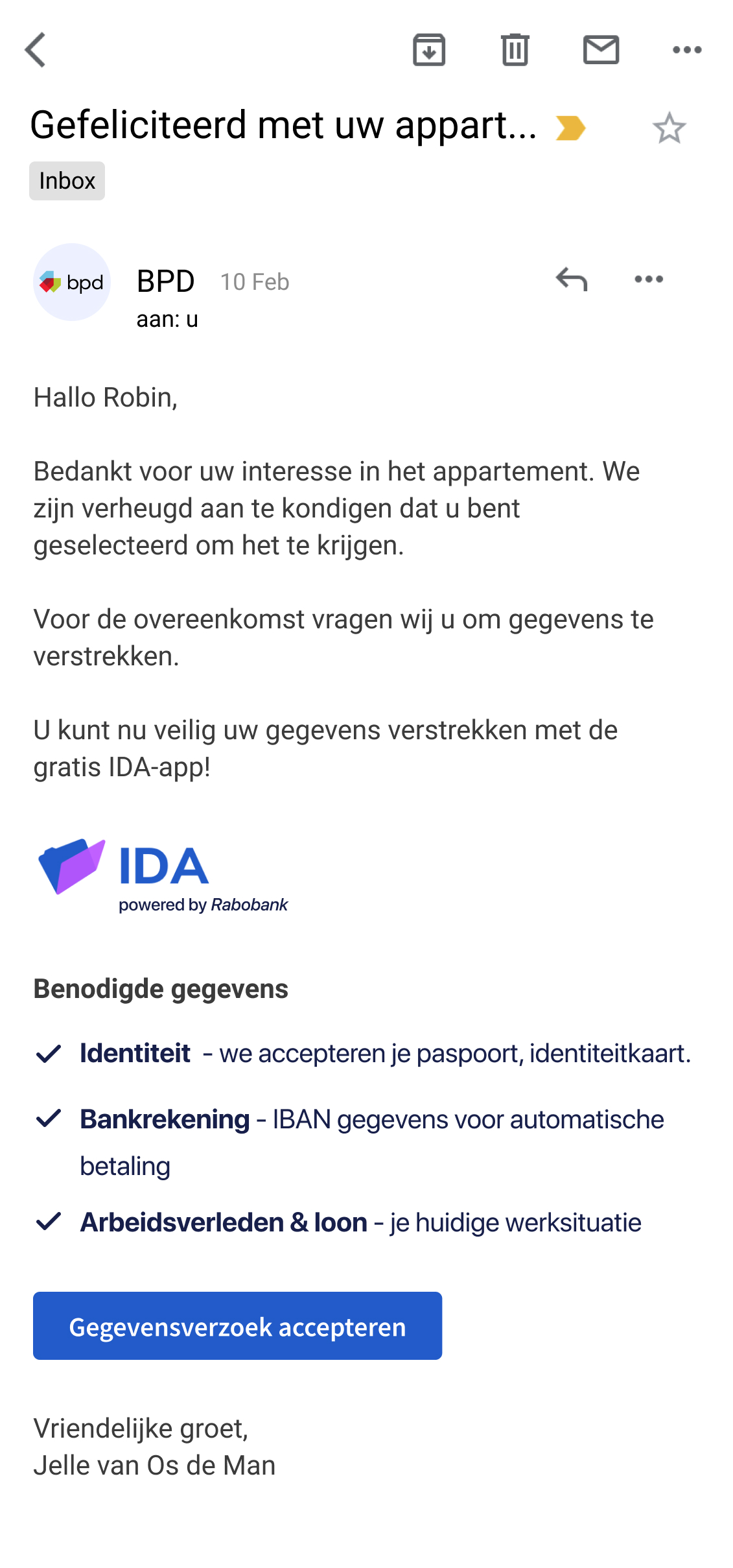
DataKeeper is now a live product that has paying customers.
People trust application to share data: during the pilot event 95% of attendees agreed to use the app to share their corona tests.
Challenge
Shape the idea of data sharing into a product that is trusted by people and businesses.
Outcome
An app that allows people to store, share and manage their data. Businesses trust in received data without seeing physical documents.
Where we started
The problem
People are not in control of their data. They don't know who and what kind of data they have about them.
People don't manage well the data that they have. Usually documents are scattered across analog and digital spaces. As a result people struggle to find necessary documents which causes stress and delays in receiving services.
On the other hand we knew that some businesses are struggling to receive authentic and valid data about their customers.
The attendee of the event has successfully shared their passport photo and COVID-19 test result and testing date with the security guard of the event. The attendee is let inside.
The idea
We imagined the future where people would be in control of their own data. Being in control means that a user can always know which documents a company has and why. A person can request a company to forget them.
At the same time companies who need to get authentic documents before serving their customers would be able to receive those reliable documents.


Onboarding screens of the current IDA application
The solution
Create a white label application where people can store not some images of their documents but retrieve data points from official documents into the app on their phone.
Only official documents' data can be retrieved into the app. These can be passports, university diplomas, professional certificates, contracts, driving licences etc.
A person when trying to get services from a company, can provide their documents without leaving home.
The company that uses the solution and receives data through the app, can be sure that the data is authentic and valid without even seeing the physical document.
Problem fit phase - validating desirability
We chose two life situations when people need to share their official documents. It was a car rental and qualification check when a person gets a new job. Each project lasted 8 weeks.
We went through many processes including value canvas drawing, user journey mapping, qualitative interviews with businesses and guerilla interviews with people.
We wanted to figure out current people and business behaviour, hurdles and workarounds in order to see if there is a problem.
One of the engineers and I are at the Schiphol airport in Amsterdam. We interviewed and showed a prototype to people who are queueing at the pick up desks of their car rental companies. When there was no queue, we interviewed employees.
Flexvault - car rental - customer journey showing steps of a user and a company as well as what kind of data points are being send at what step


"Flexvault" experiment screens: 1) Pending request for information; 2) Completed request for information; 3) Documents that have been uploaded into the app


"CareerWallet" pilot screens: 1) About to send your data screen; 2) Success; 3) Home screen with the professional certificate; 4) Historical info and details of the certificate
Solution fit phase - validating viability and feasibility
I started designing MVPs based on our findings and technical limitations. Each project lasted 8-10 weeks.
As the only desginer I was responsible for organising team sessions in order to refine user journeys, draw and discuss user flow during design studios and later discuss wireframes during design critiques. Also I made sure to involve my team in usability testing interviews.
Solution fit phase team and design activities - many post-its, workshops, wireframes and testing sessions with users
3 MVPs built to test the solutions with real customers of our partners
During "Careerwallet" and "Flexvault" projects we closely worked with companies that agreed to partner up for the pilot and test the solution with their real customers.
Once the apps and portal are ready, we set up experiments of 2 months and trained staff.
We built "Unlock" app when COVID-19 pandemia hit and the Government of the NL announced the public tender for the Covid-19 pass app.


We built 3 MVPs with different partners to test the solution with real customers who are going through a real life situation that we are trying to make more convenient.
Challenging insights from pilots
The main finding was that people see the potential in the solution, but they won't use it if only one life situation is available on it.
Another big discovery was that people don't care about being in control of their data. Most of them don't believe that it’s possible to be private online. What they really care about is convenience and time saving.
It became clear that endorsement from the Government and key businesses is crucial for creating trust in the solution. Therefore we had to rethink our strategy and course of actions.
Time to pivot and go to Market
We have decided to build one application for all life situations owned by Rabobank, instead of a white label app.
The new application name "IDA" was created during the workshop with the whole team and stakeholders.


Screens from the IDA app that was designed in the beginning of market fit phase
New problem statements
How might we create a convenient way for people to share just the right amount of personal data when buying services or products from businesses?
How might we create a time and resources saving way for businesses to receive authentic and valid data from their customers?
IDA vision
IDA is a generic app that can be used every time people need to send their data to businesses.
There is no need to take photos of documents or search for them in drawers when applying for a mortgage or renting a car. People can provide their data via the app from the comfort of their home.
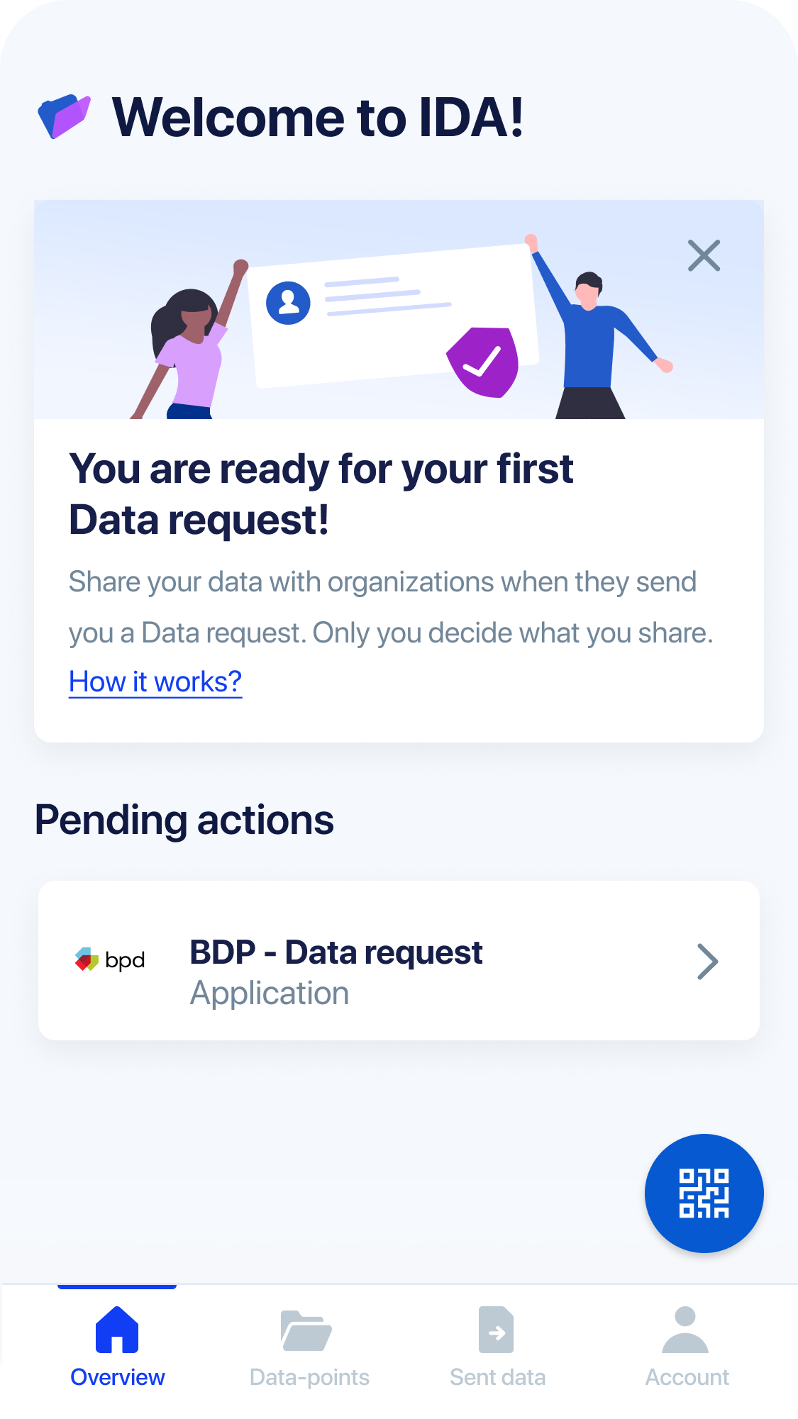
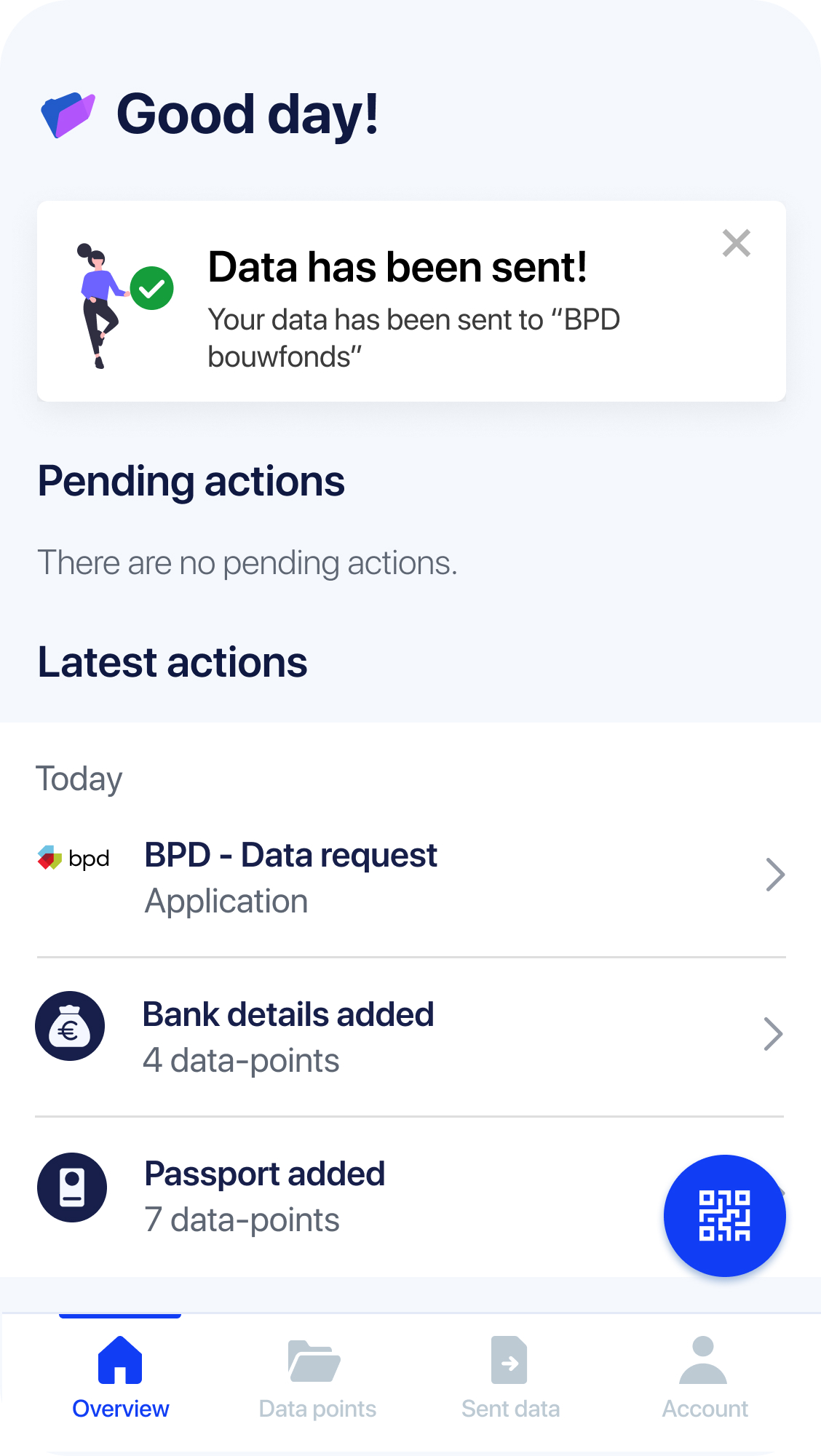
IDA homes screen with pending request for information
Value proposition for people
Convenience - users will need to retrieve data from their documents just once and then can send them to companies just with one click.
Data minimisation (privacy) - users would send not the whole document's data but only a selection of data-points so they would never overshare data.
Safety - retrieved data is not on a cloud or a server, it is stored on a user's phone and only a user can give their consent to send data.
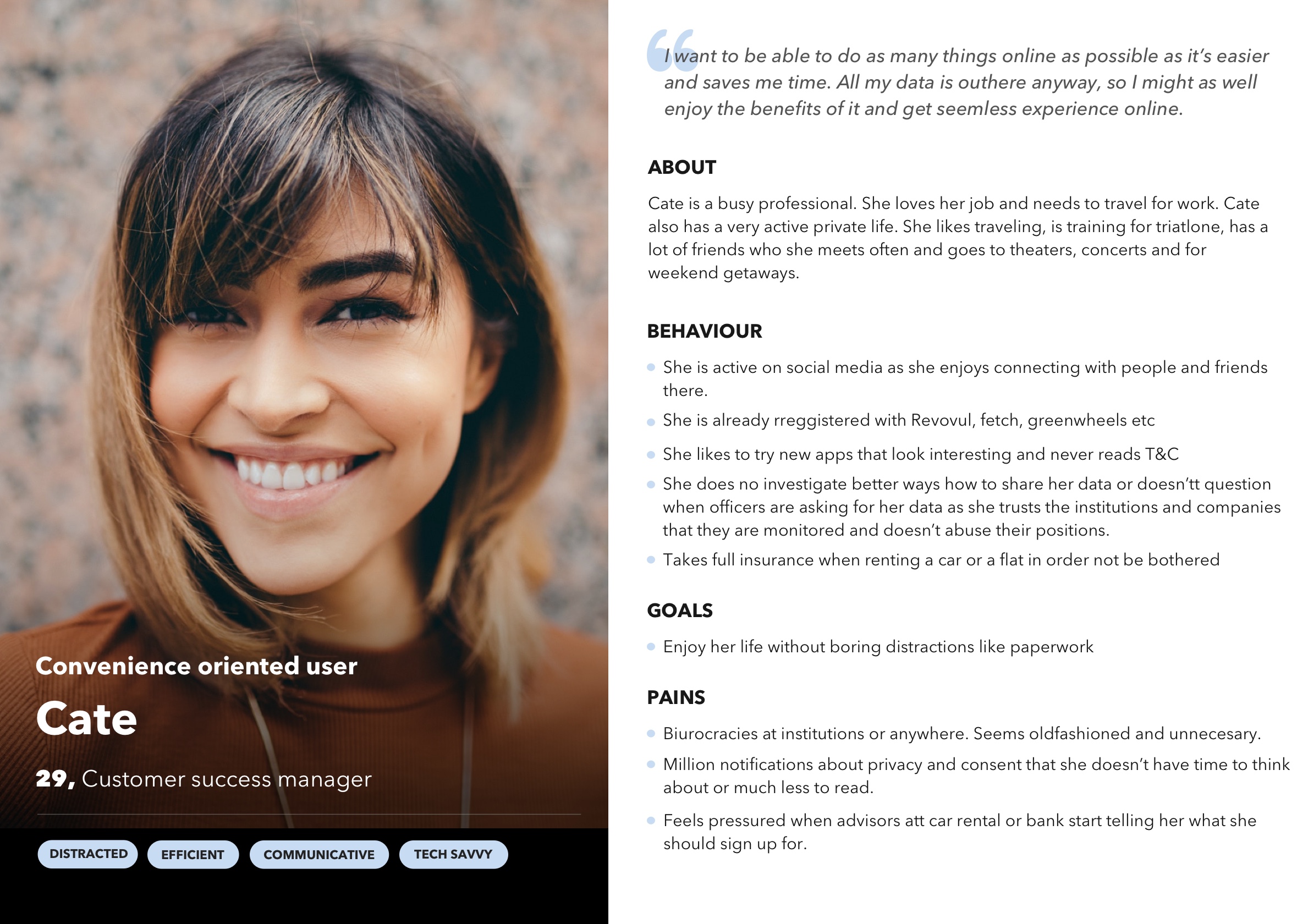
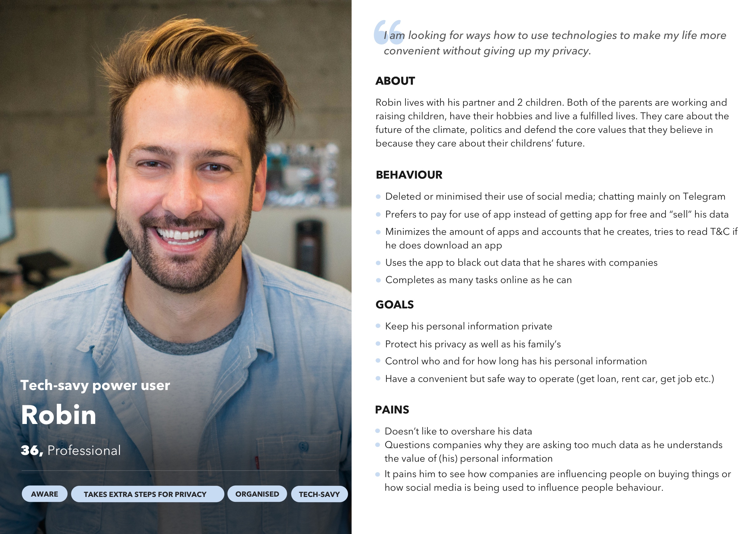
Two key personas of IDA app
Personas
Based on the experiments and UX interviews before starting Market fit phase we created two key personas that will be our early adopters.
The personas are somewhat similar but the main difference is their interest to understand how it all works. Cate persona primarily cares about convenience while Robin cares about convenience and privacy on equal measure. Robin is a power user as he reads through and clicks everywhere, he is very interested in data minimisation feature.
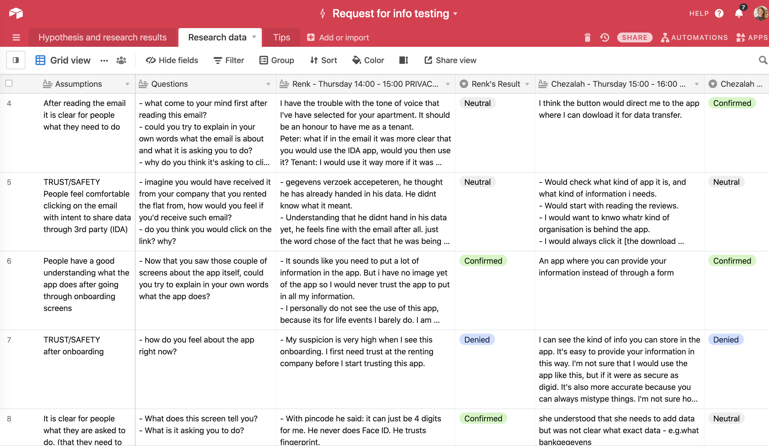
Screenshot of results from one interviews rounds on Airtable
UX Research
I have created the research template that helps to evalutate the results of the interviews by revieing if assumptions were confirmed, denied or neutral.
Each research round has a hypothesis and several assumptions. Many assumptions have two aspects: usability and perceived trust.
Design challenges and solutions that were tested and shipped
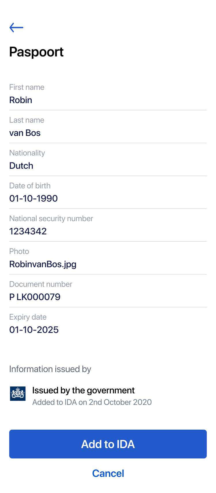
Mid-fidelity prototype of the flow to add passport data
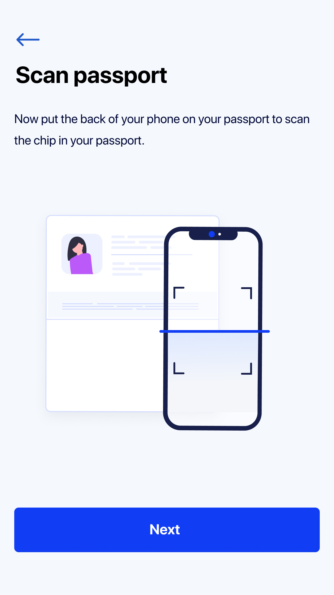

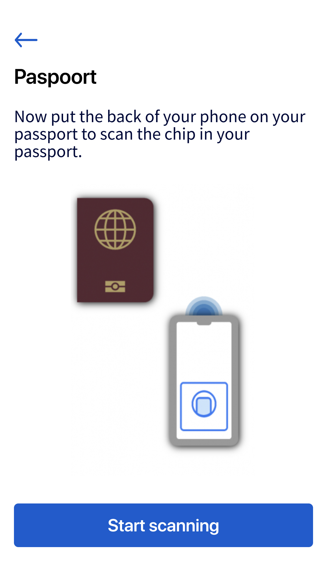
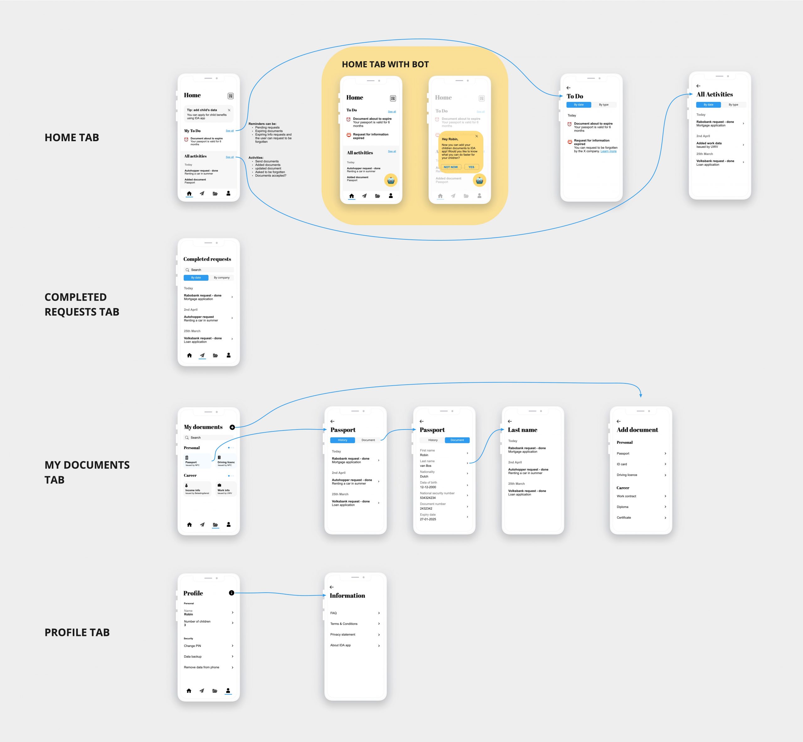
Latest IDA app flow to retrieve data from a passport
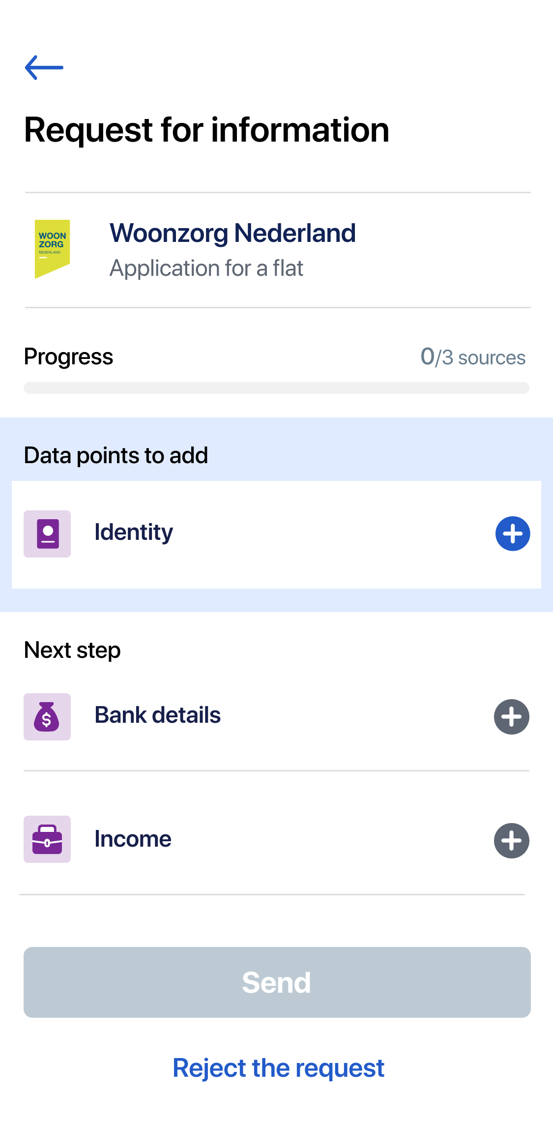
Challenge 1
Make it clear to a user that data has to be added to the app before sending
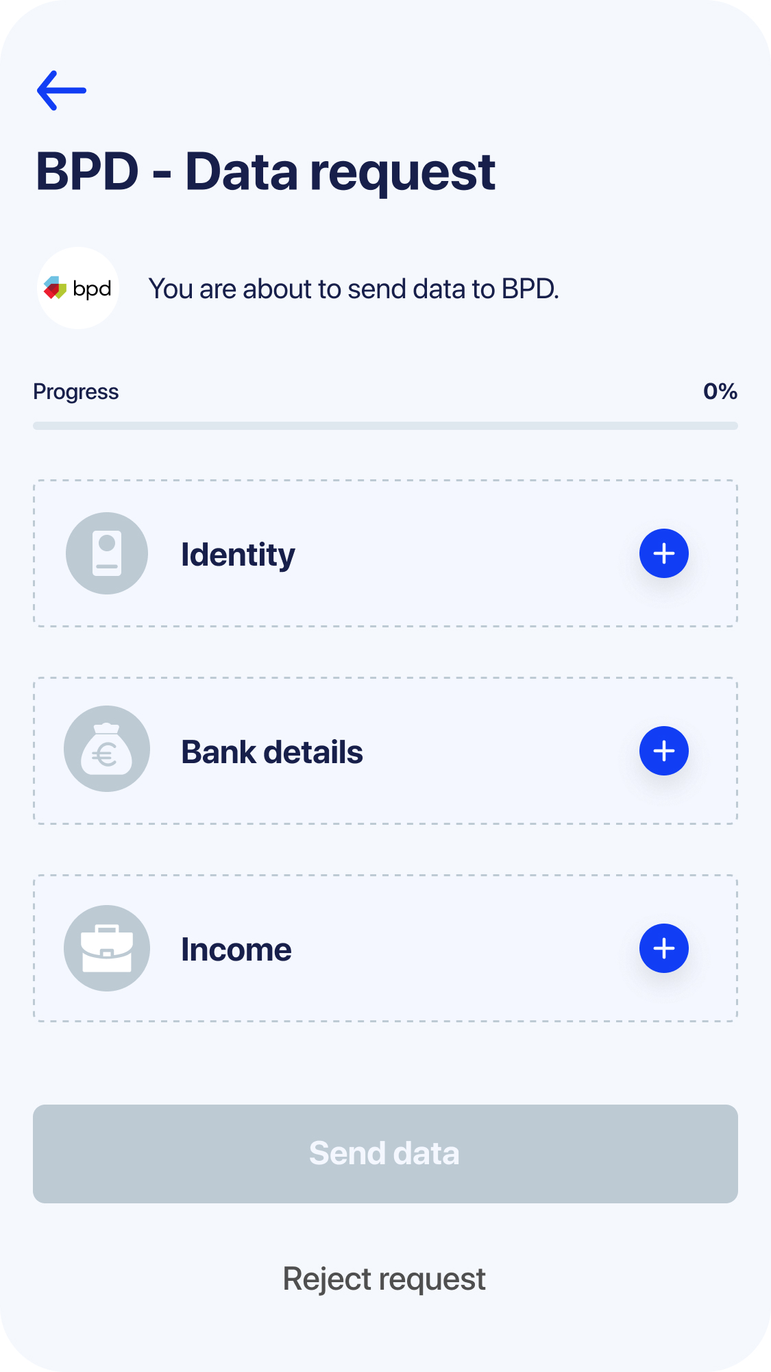
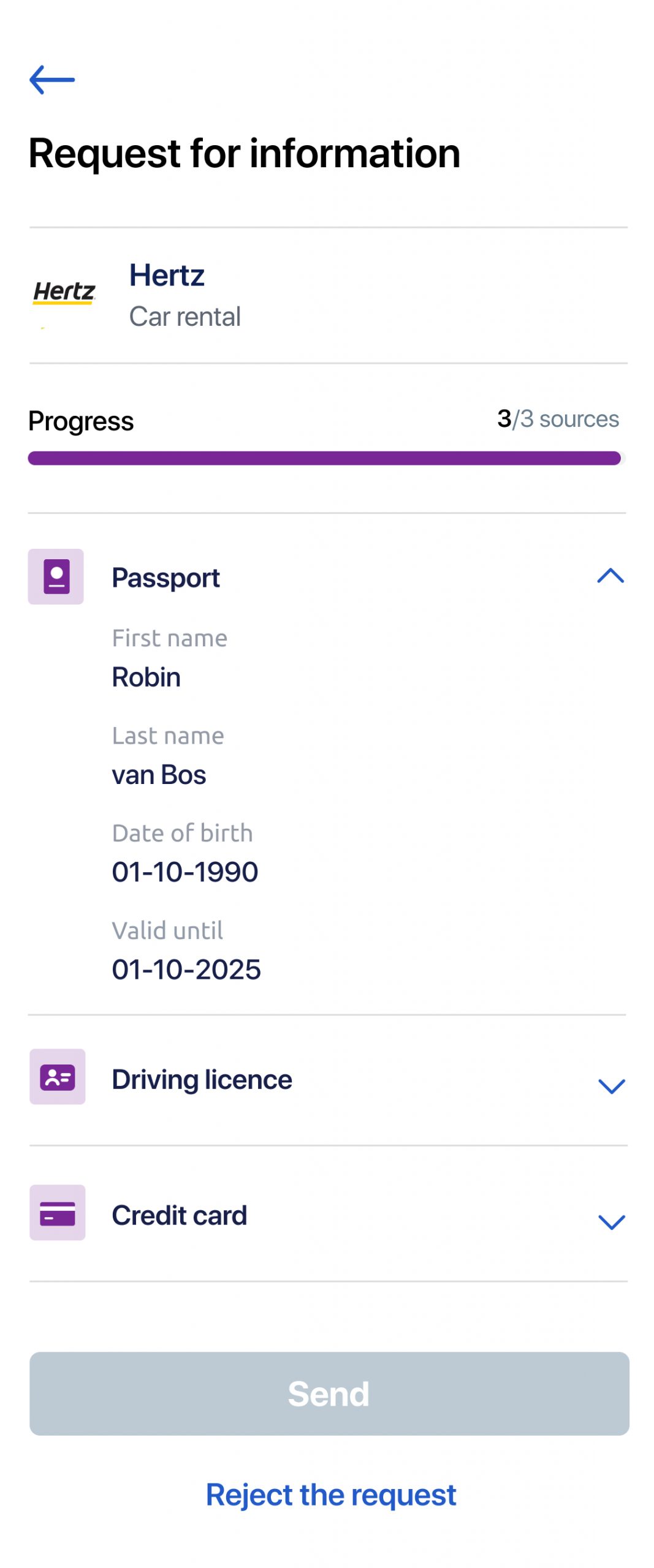
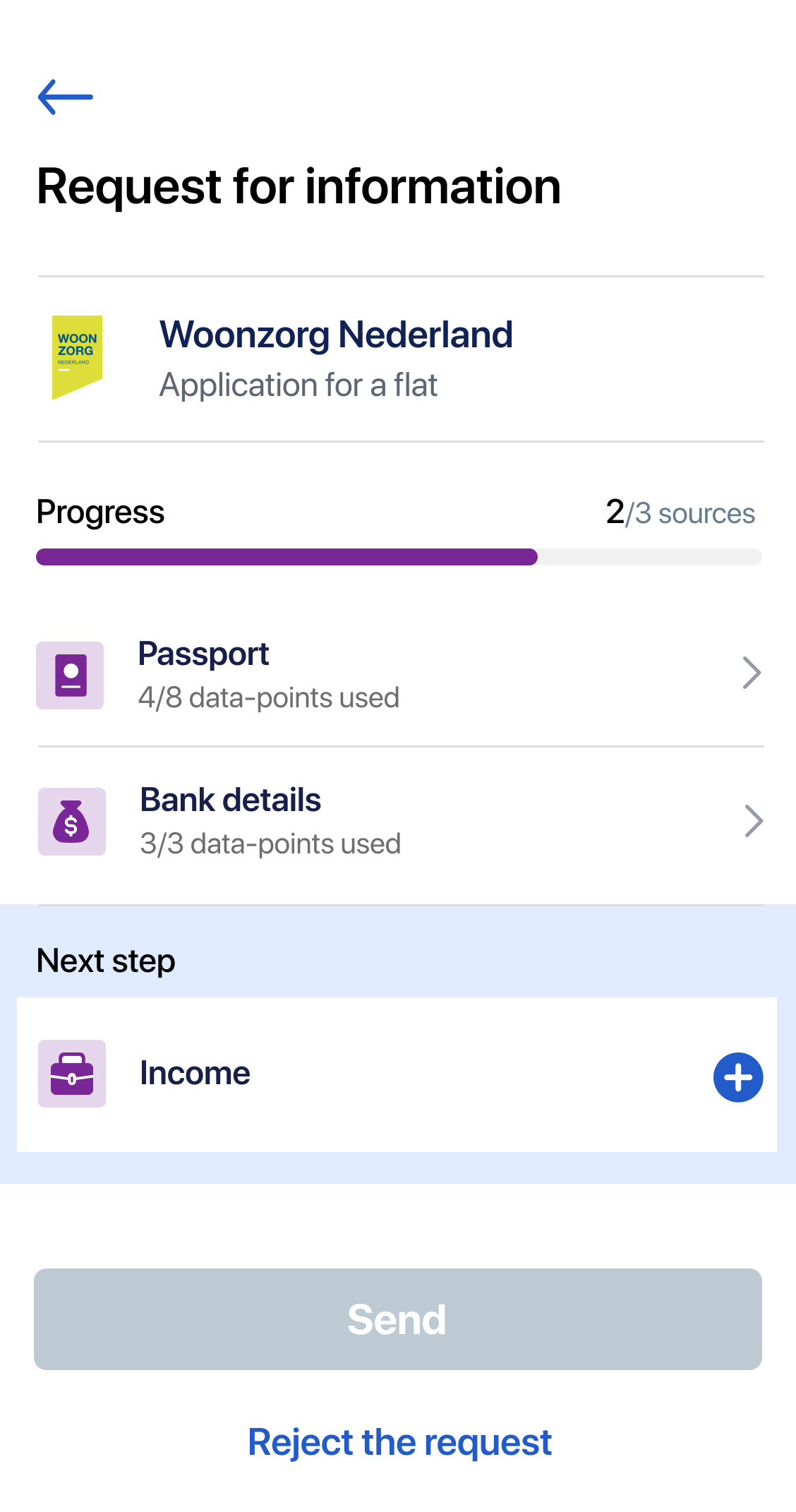
Rows with dotted borders and blue Plus buttons were the best indicator for users that these documents are missing. When users start adding documents, a progress bar fills.
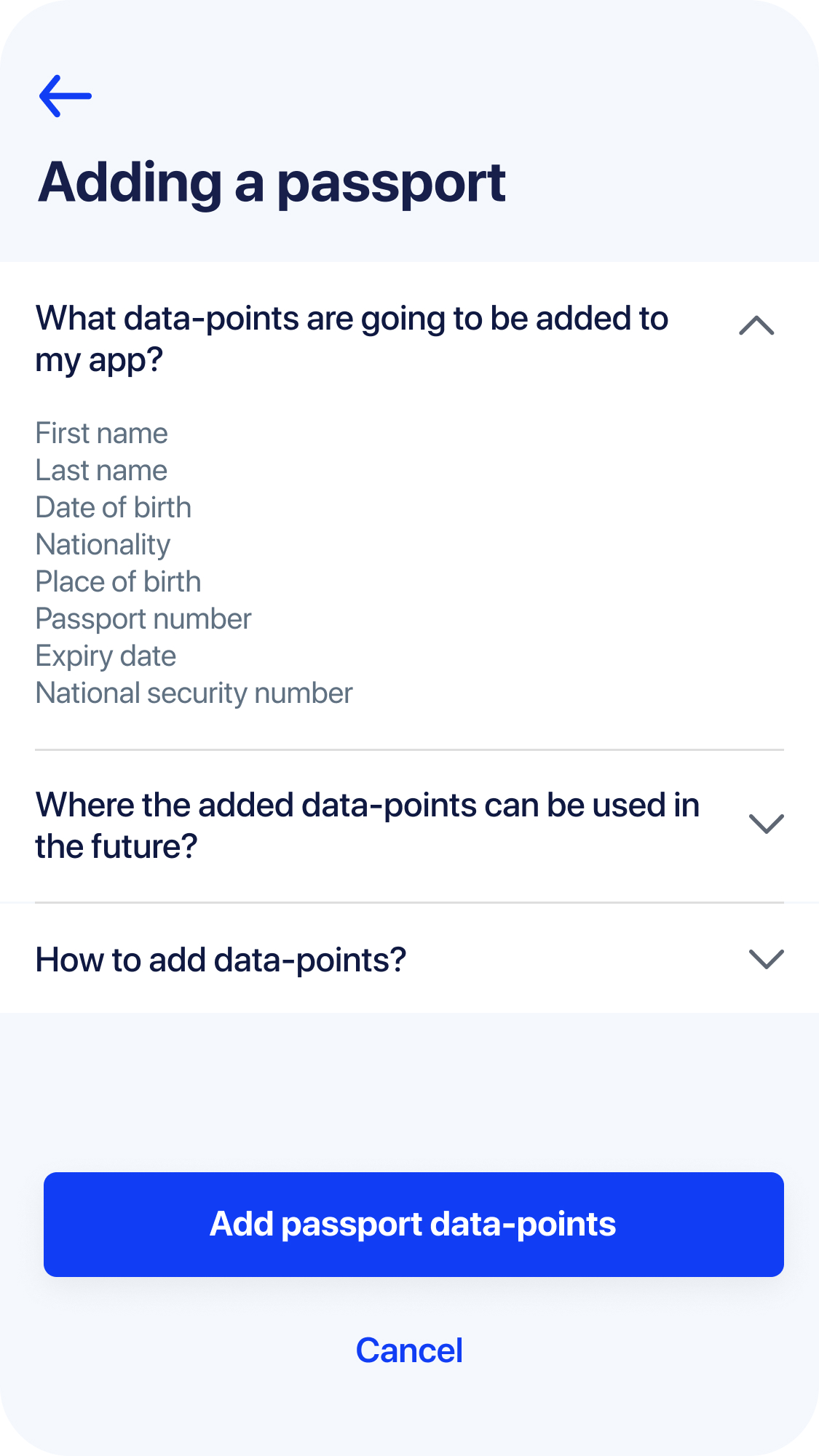
During the interviews tech-savvy people wanted to know upfront how the process of adding document data works and what will be added. Hence we decided to have instructions screens before adding any kind of document to the app.
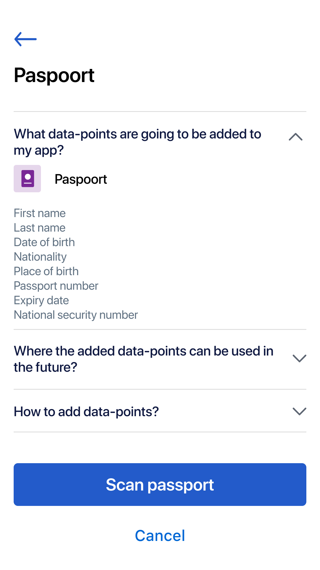
Users have to give consent to add a data set that was retrieved from a document.
One of the early attempts to show data minimisation feature
Another attempt to show data minimisation feature 1/2
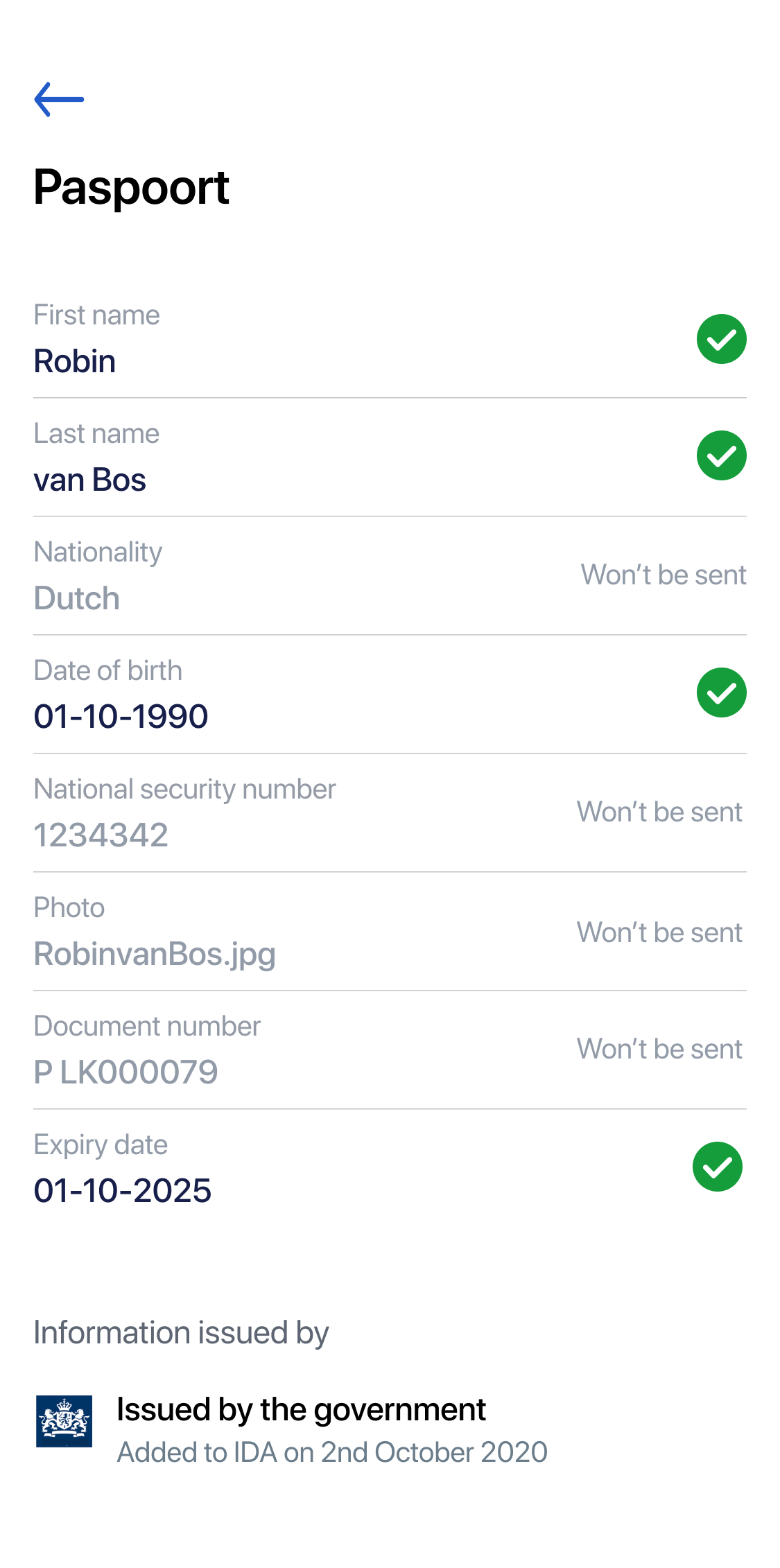
Another attempt to show data minimisation feature 2/2; user sees full list of data points
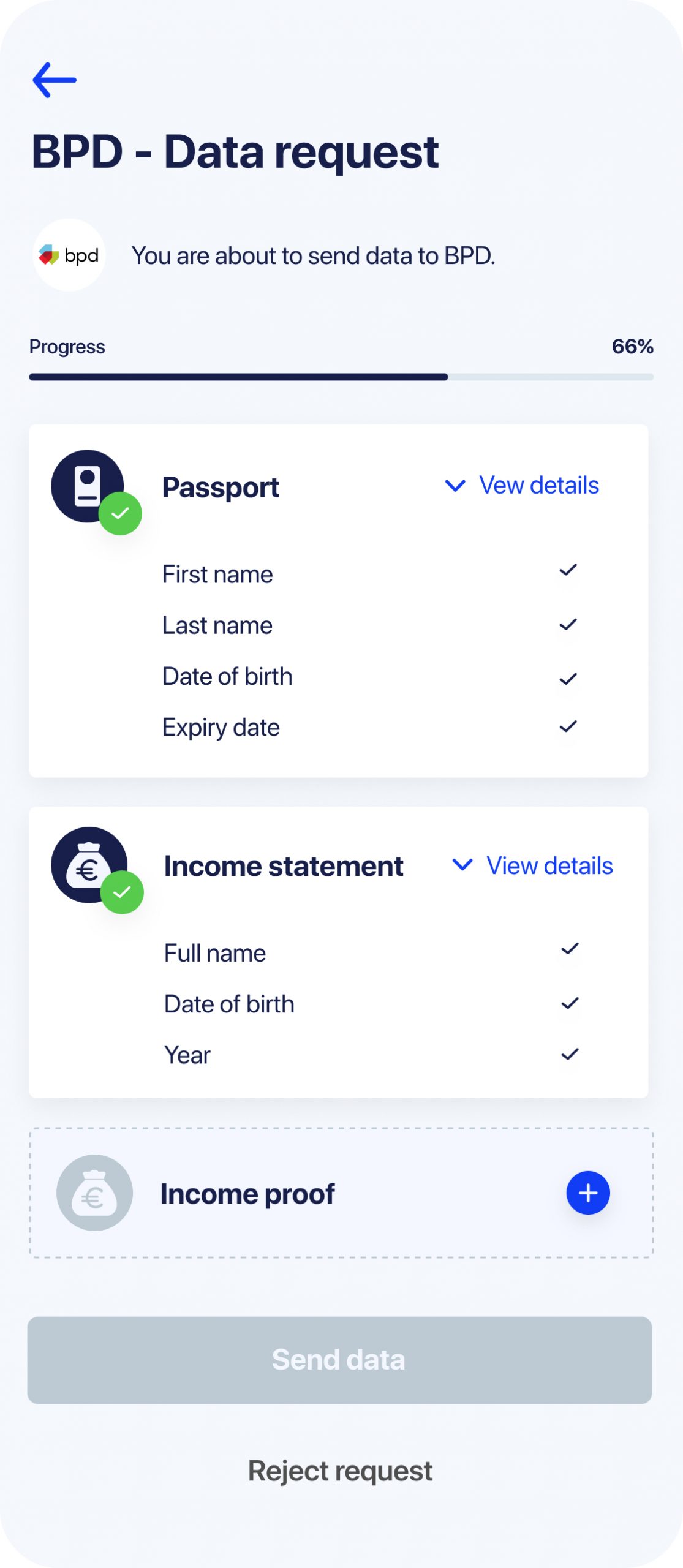
Challenge 2
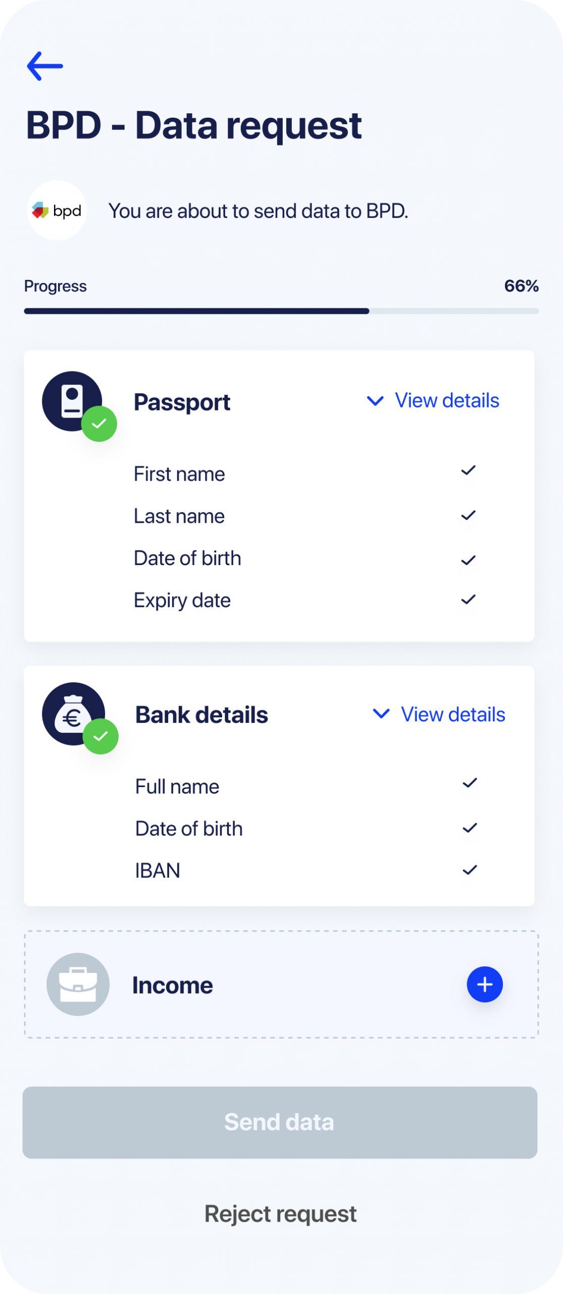
Show that not all data from a document is going to be sent
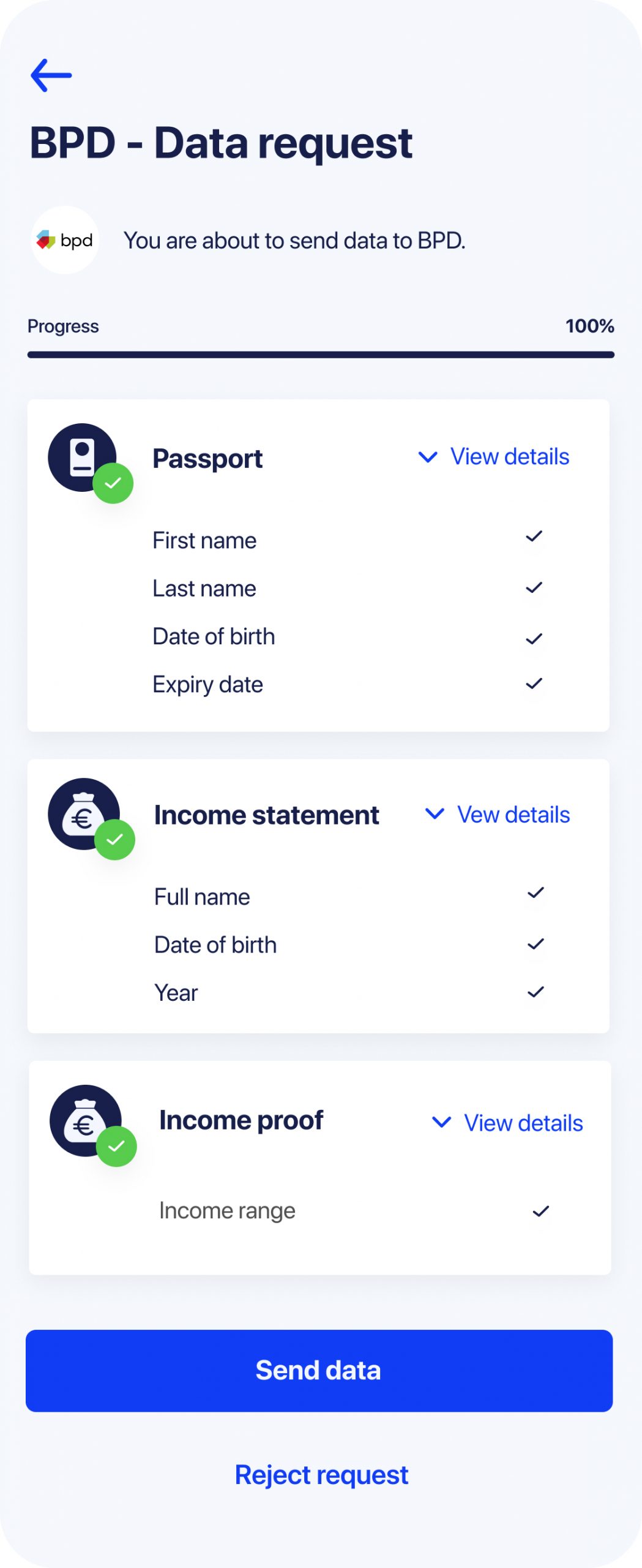
This design serves two purposes. Firstly users can review what data exactly they are about to send. Secondly they can clearly see that not all data from a document is there.
People who represent Robin persona really appreciate this data minimisation feature.
The values of data-points are not visible immediately as we know from research that people don't want anyone to see their personal data when they are sending it in public.
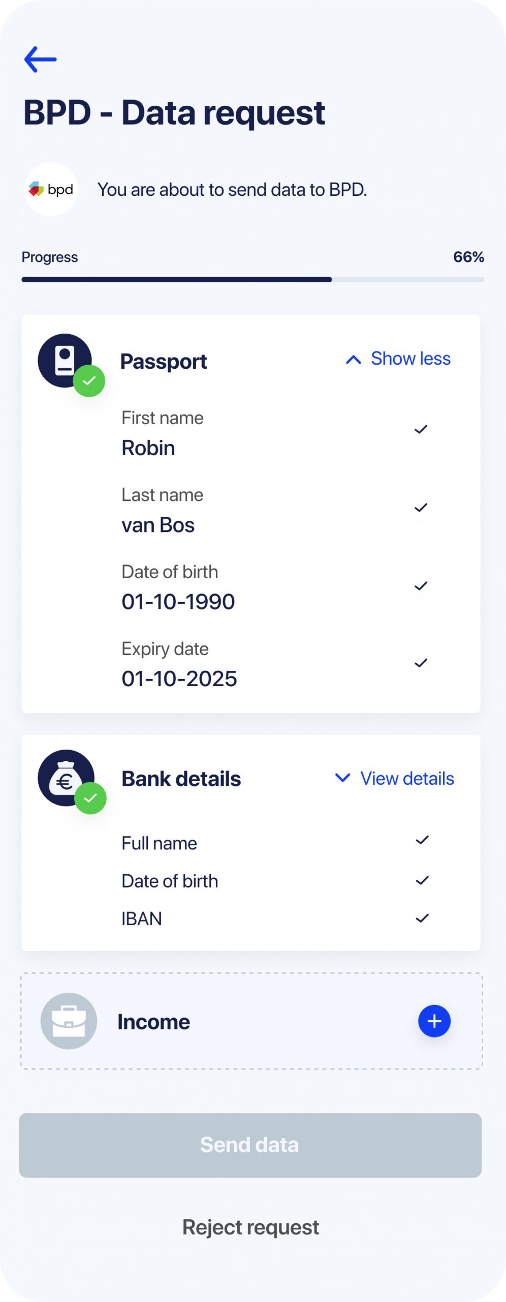
Final design. Users can immediately see what data-ponts wll be sent and can expand the list to see values if they wish
The first wireframe of the navigation
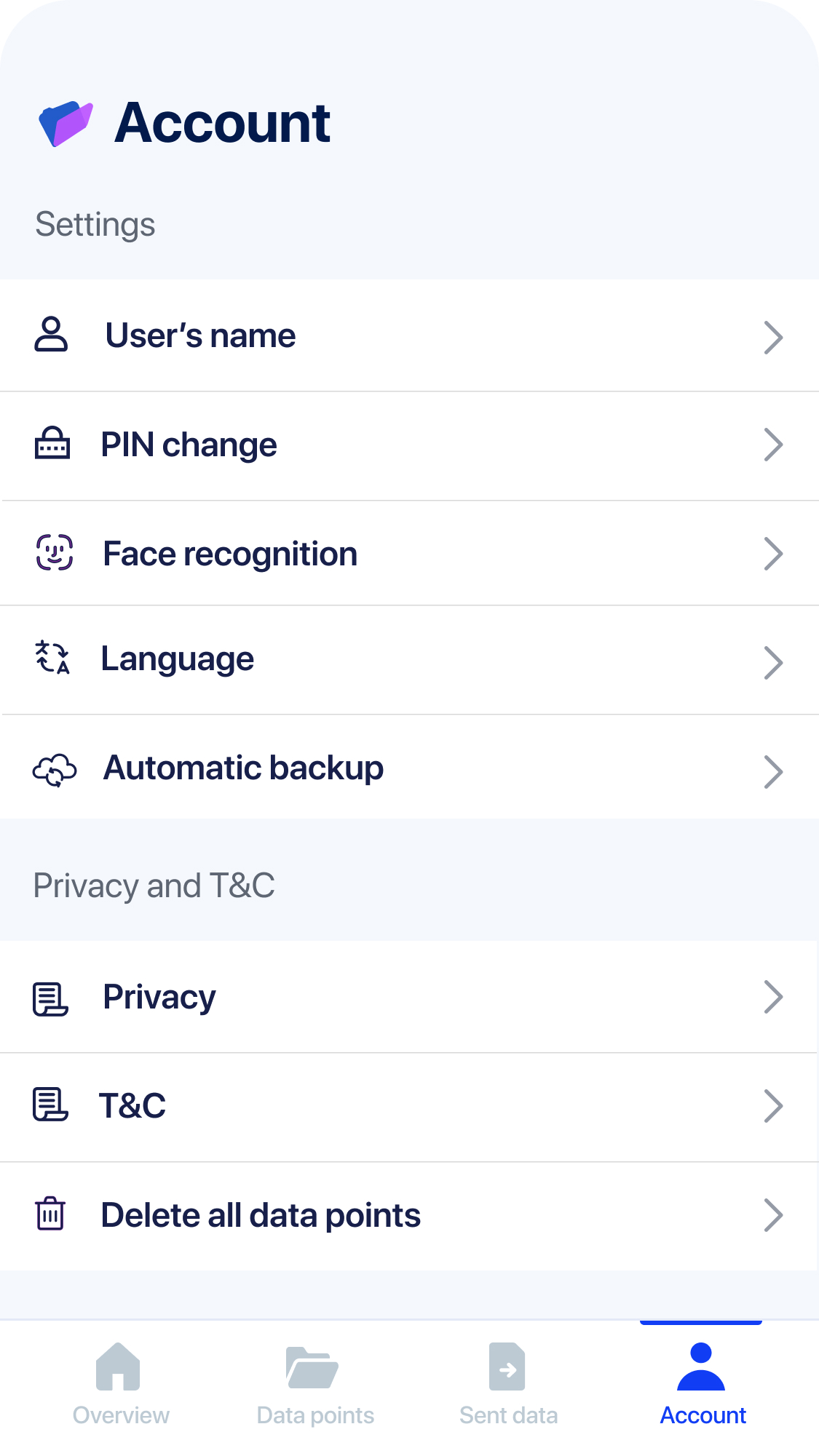
Bottom navigation of IDA app. 1) Overview; 2) Data points 3) Sent; 4) Account
Challenge 3
Design app navigation so that users understand what they have done and where to look for information
User research showed that Overview tab design is the most clear when it contains overview of pending and the latest completed actions.
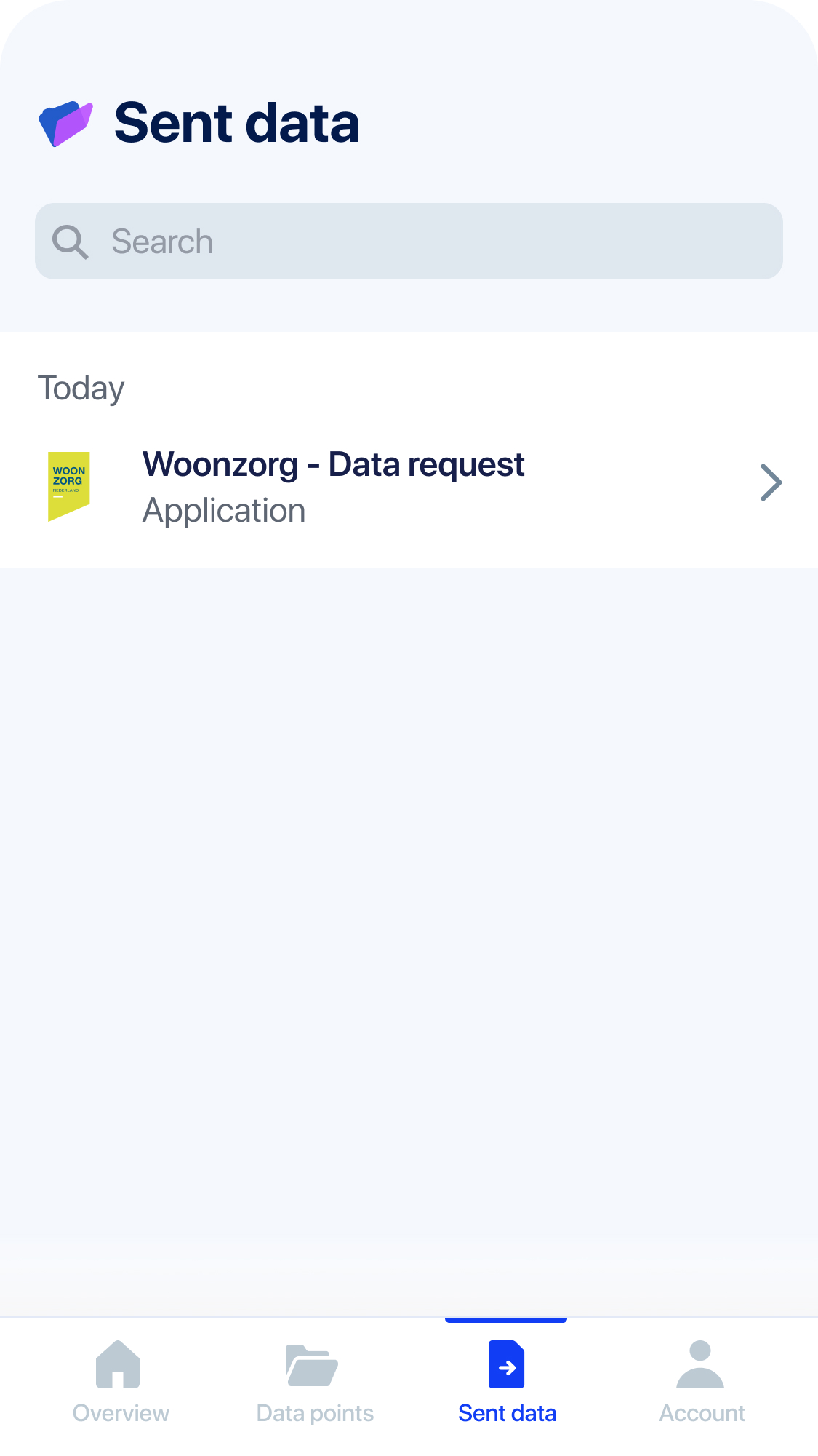
When we asked users to find out what kind of data points they have sent to a company, 100% of them went to Sent data tab.
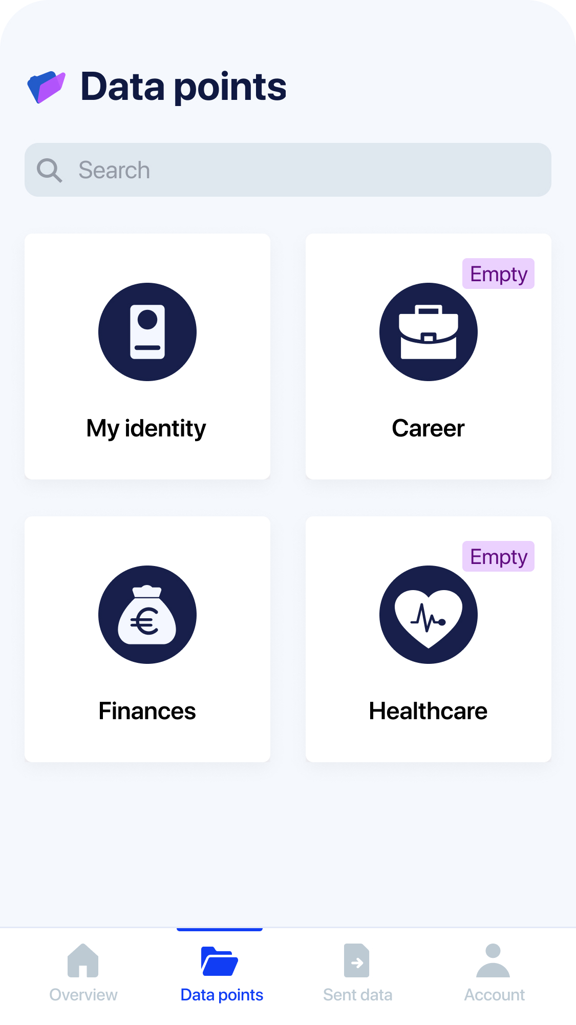
Data points tab is where all user data is stored. We deliberately wanted to move away from the concept of documents and make users think in data-points that can be separated from documents. This helps users to understand data minimisation feature.
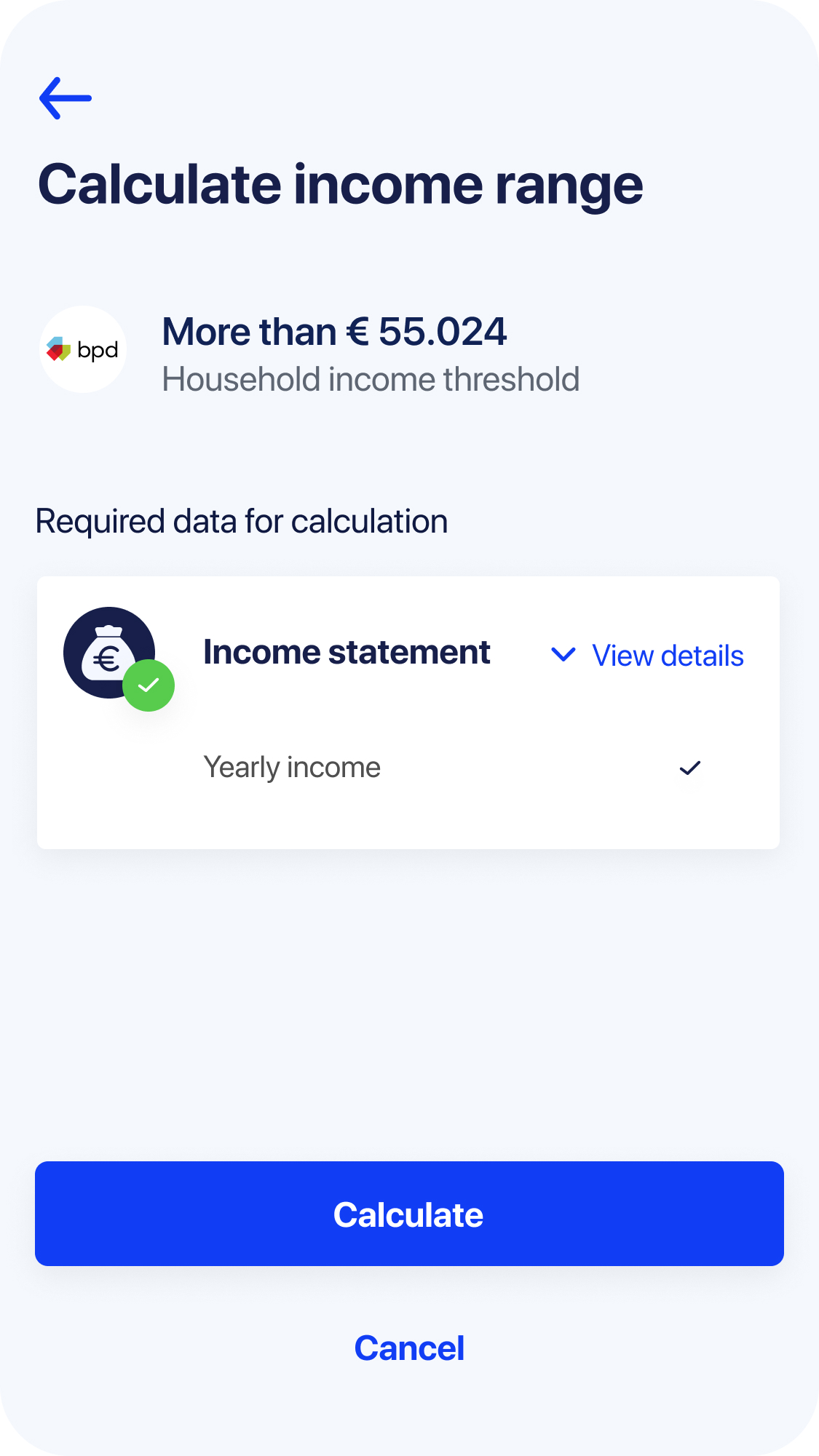
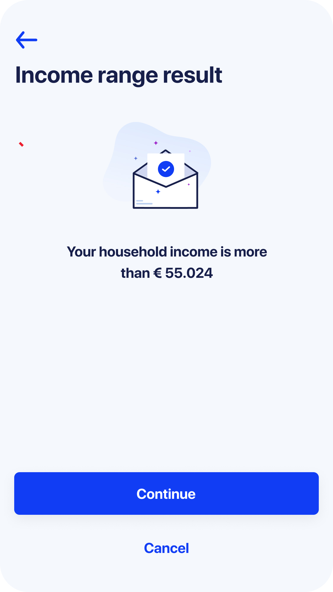
Zero knowledge proof feature flow
Challenge 4
How to make it clear that the actual number of user's income is never sent, only a range
IDA app has a feature that protects user privacy more than any other tool. Zero knowledge proof technology allows to convert any numerical data into a range or limit (e.g. when buying alcohol people won't need to show their passport but just a proof that they are older than 18 years old).
IDA app can calculate the range of income immediately after a user adds their income data into the app. However we have to make a user click through the flow and see how it is calculated for them to understand and appreciate this feature.
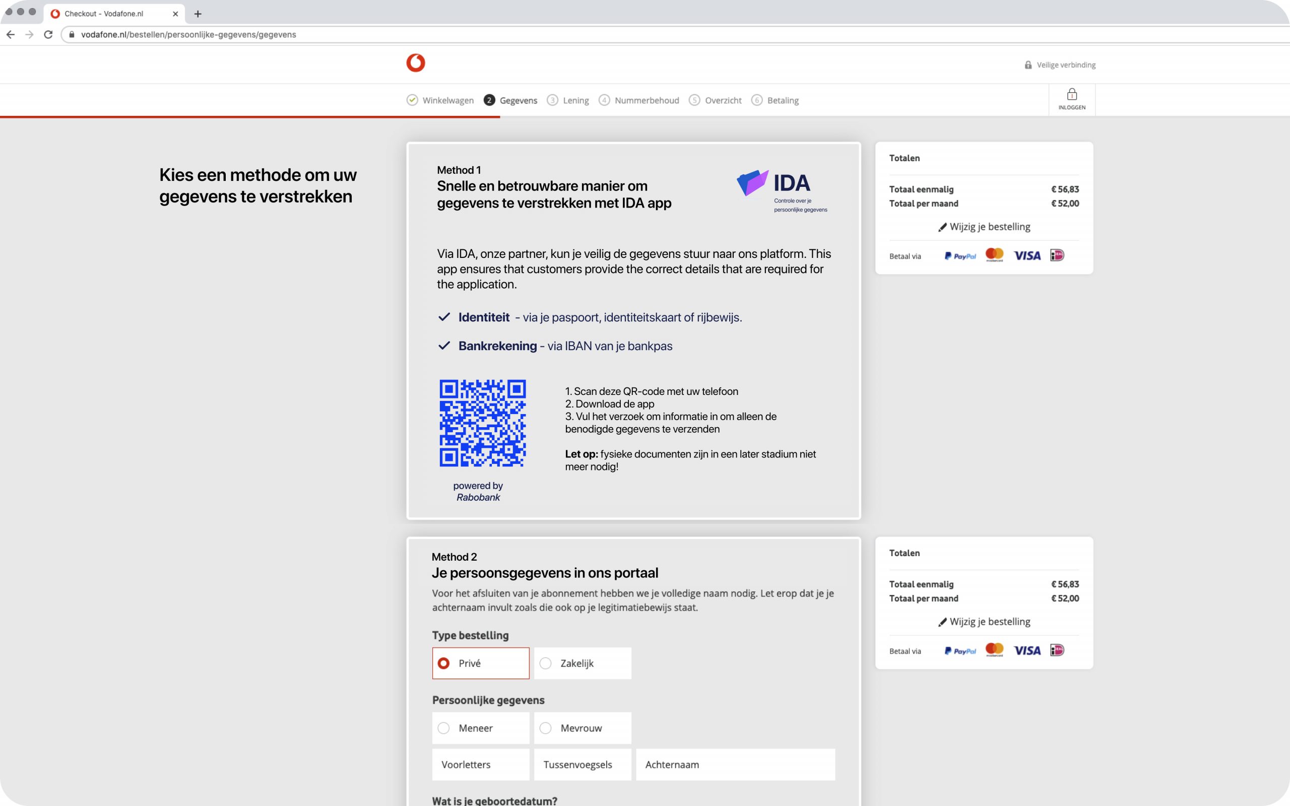
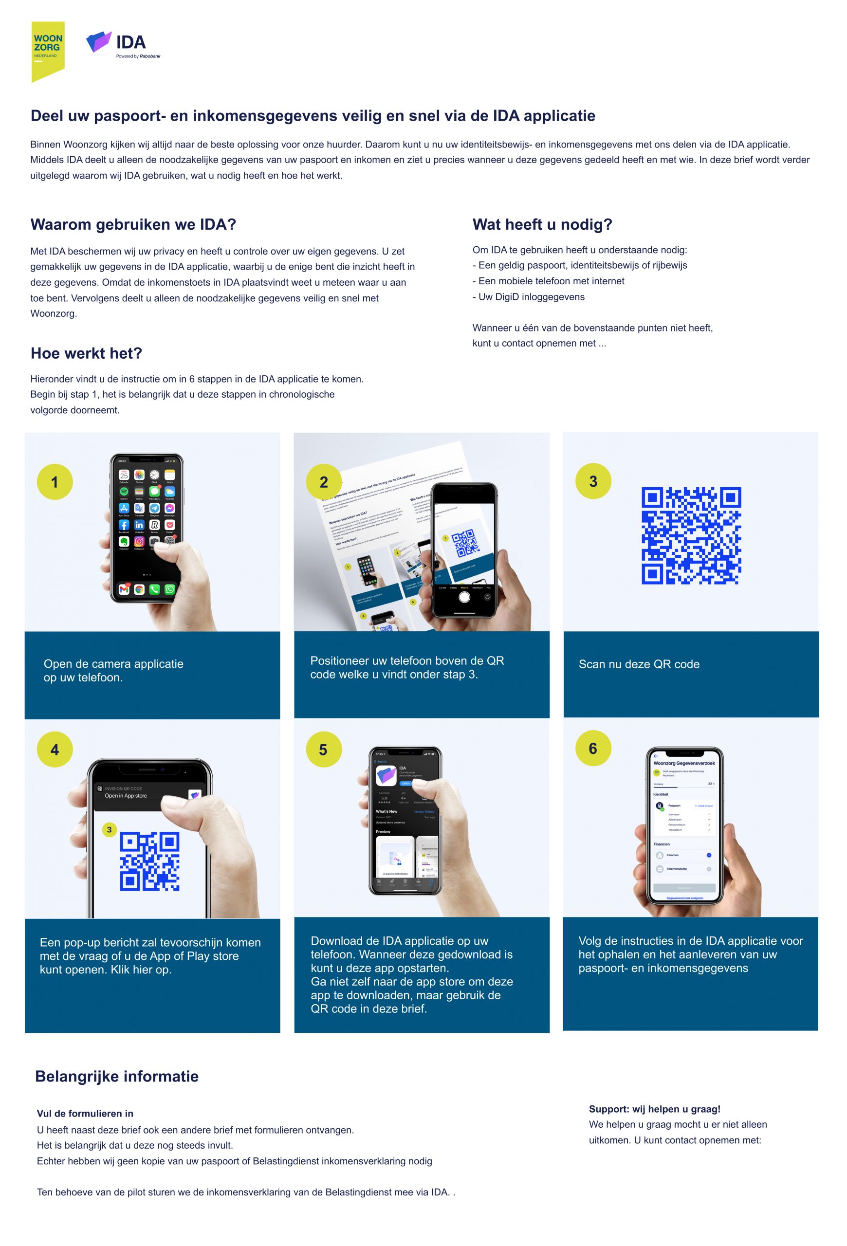
Examples of different portals of business where they receive user data as well as physical letters and email communication with users to introduce IDA app to people
Challenge 5
How to introduce IDA app to people for the first time? How to create trust and show its value?
Depending on the type of client and current processes we have designed and tried several ways to create awareness about the app for new users. We also adjusted the portals to receive data in a way that is convenient for businesses.
No matter which client we work with, we now know several rules that the user introduction flow should contain:
- People have to see IDA logo on business websites and emails.
- There must be very clearly articulated value for users in order for them to choose IDA over the regular flow.
- It is very important to tell upfront what kind of data and why it will be requested to send.
Conclusion
The app with the new name - DataKeeper - continues without me
As the branding agency finished its work and changed app name from IDA to DataKeeper, my time with the project ended. My skills were requested by another client and the new team of UX and UI designers took over.
When I left there was one paying client Fieldlabs (see video at the top), 2 potential paying customers were running pilots and 2 were waiting in the queue.
I hope DataKeeper app will be widely advertised as the safest data sharing app that makes peoples' lives more convenient.
Feedback from the team
"I worked with Vaiva on the Innohub/IDA project. Since I have joined the project, I have been positively impressed about how she successfully brought her User Experience design and product skills to the table.
She understands business and strategic decisions and she translates the requirements into design outcomes by creating wireframes, preparing design studios and testing prototypes with real users.
Easygoing, engaging and positive person to work with."

Senior designer @Mobiquity at the time
"Vaiva has reasoning behind decisions and happy to share it. Mainly it is a result of user research.
She understands the subject matter really well. All the user and data flows. Even some deep technical details. If someone would tell me Vaiva is a business analyst, I would have no doubts.
Spreading a positive mood is another strength that she has. Vaiva works really well with the iterative approach. She deals well with the half baked solutions. The presentations of the team work delivered by her are always enjoyable, she is very flexible and adapts well to constant changes"

Igor Afanasov
Principal engineer / Frontend competence lead @Mobiquity
"Vaiva is one of the most talented, cross skilled and effective product designers I have had the pleasure to work with.
I have always been in awe of her majestic ability to orchestrate, drive and follow through multiple threads of work seamlessly, be it user experience strategy, a usability workshop, rapid experimentation techniques and planning, or product design related activities."

Lucia Collará
Lead product manager @Mobiquity at the time
Team operations
Team setup
Problem fit phases (8 weeks)
1 Designer (me)
1 Product manager
1 Stakeholder
Solution fit phases (8 weeks)
1 Designer (me)
1 Product manager
4 Software engineers
1 Blockchain engineer
1 Security engineer
1 Solutions architect
1 Stakeholder
Market fit phase (8 months)
2 Designers (me and a colleague)
2 Product managers
12 Software engineers
2 Blockchain engineer
1 Security engineer
1 QA engineer
1 Solutions architect
6 Stakeholders
1 Branding agency (external)
Methods and practises
Qualitative interviews
Guerilla interviews
Usability testings
Design studios
Design reviews
Wireframing
Prototyping
User journey mapping
Personas definition
Card sorting
Experiments
UX/UI design
Service design
Strategy
Security threat analysis
Tools
Sketch
Abstract
Invision
Figma
UsabilityHub
Maze
Miro
Airtable